Clarity Design System alternatives
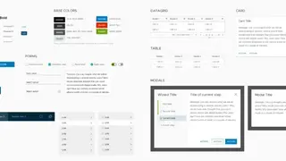
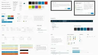
Clarity is a powerful, high-performance, fast, and open-source design system empowered by the community who use it in their apps. Its toolkit is Figma, and each component, guideline, and pattern is based on real customer interactions. You can make use of more than 30 components and more than 200 icons for concentrating on product-specific user problems. Initially, Clarity was built by a less professional team of content creators, developers, and designers and since then has matured to a robust version.
It has continued expanding by being compatible with major frameworks like Vue, Angular, and React. All of its components work on each of the mentioned frameworks. Moreover, you can take a look at the provided code examples and in-depth API documentation for building the next app. Clarity Design System is powered by performance components and regularly listens to the concerns of its customers.
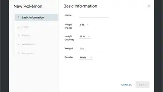
Recently, it has introduced the data grid component, which is compatible with tons of features and is able to sustain dozens of data entries. The Angular Components include Checkbox, Badge, Accordion, Alert, Signpost, Select, Sidenav, Timeline, Tooltip, Toggle, Stepper, Spinner, and Stack View. Besides these, it has many core components like Tag, Range, Input Group, Password, File, Icon Button, Form Group, Divider, and Data list.